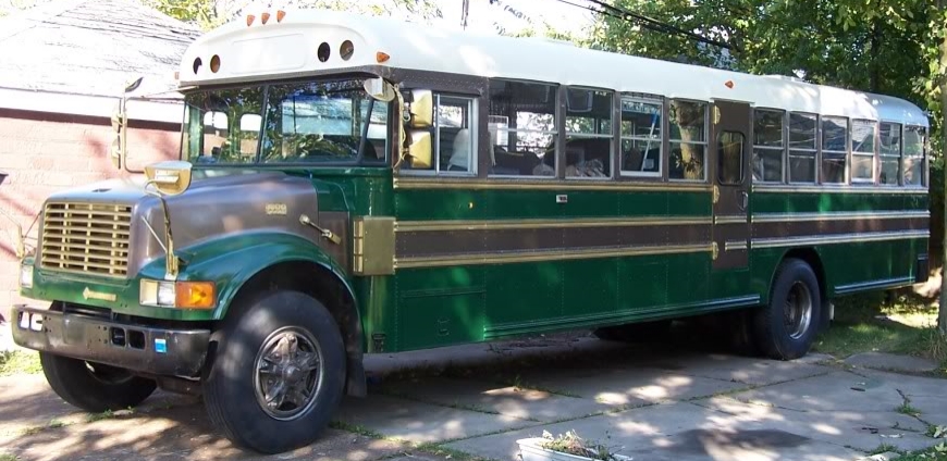
In order to get to doing anything with a bus that isn’t being a bus, you have to remove the seats. And this is critical not just for floor-plan stuff, but for insurance and registration, unless you’re a commercial business and you don’t mind paying the rates for commercial insurance (Yikes!). Now, you remember all those seats, right?
Now, the seats are in with 5/16″ bolts of varying lengths through the floor and then 9/16″ bolts into the seat-rail along the edge of the wall, and, had one a team of people, and if the bolts weren’t very rusty, one could use a ratchet and/or a couple of wrenches and remove the bolts, and then the seats, and all would be wonderful.
But I live in the real world, and the bus was used by the Whitesboro High School (near Syracuse) and being that Syracuse was known as the ‘Salt City’ (due to the salt from the evaporation of shallow seas that covered the area in the Devonian), the bottom of the bus was covered in a light layer of salt, and the bolts were heavily corroded.
Here was the introduction of power-tools to the game. First, I had a Makita impact hammer with a chisel blade that does wonderfully on concrete, but did basically nothing the the rusted-on bolts. I had hoped to use it as the force is a shearing force, and would leave the flanges of the bus feet intact. I ended up using a Makita 4″ angle grinder to take off the heads of the bolts. A tip that I got from the Skoolie board stated that an easy way to deal with bolt heads was to cut down vertically through them and then horizontally slice to the cut. It worked nicely, produced a whole lot of smoke, sparks, and burned rubber smell (more on that later), and the seats came out really nicely. When I had the seats all loose from the floor, I picked out three that were the ones I was planning on keeping for re-installation.
Once a bus has the seats out, it’s a big empty space.
 |
| “This is really funky, it’s kinda like one big empty room, yeah!“ |
 |
| No, really … It’s a lot of space … for a vehicle. |
In fact, disregarding the wheelwells over the back, you can imagine it as basically a big rectangle 90″ wide, 26′ 8″ long (to the back of the driver’s chair), and just over 6′ high. That’s around 200 square feet of floor space. The wrinkles, of course are the wheelwells, roof hatches, and the exit doors. Now, many people close up the side emergency doors (if their bus has one), but we wanted to keep ours, so we had to design around it.
There were some design constraints and advice that I gleaned from other Skoolie builds, things like you don’t really want to put your bathroom (and grey and black water tanks) behind the rear axle, due to the bouncing. Propane tanks should go ahead of the rear axle, due to safety factors in collisions. Re-using the frames of the existing bus seats gives DOT rated safety harness points. There was one seat we removed (just by the side emergency exit door) that had four feet, while all the others had two feet on one side, and were meant to attach the other side to the seat-rail.
So we ended up with these preliminary plans:
 |
| With a fold-out master bed and an added rear observation deck. |
 |
| With a fixed master bed on the port side … |
 |
| The annotated final design. (New emergency exit window locations in red) |


Liked!